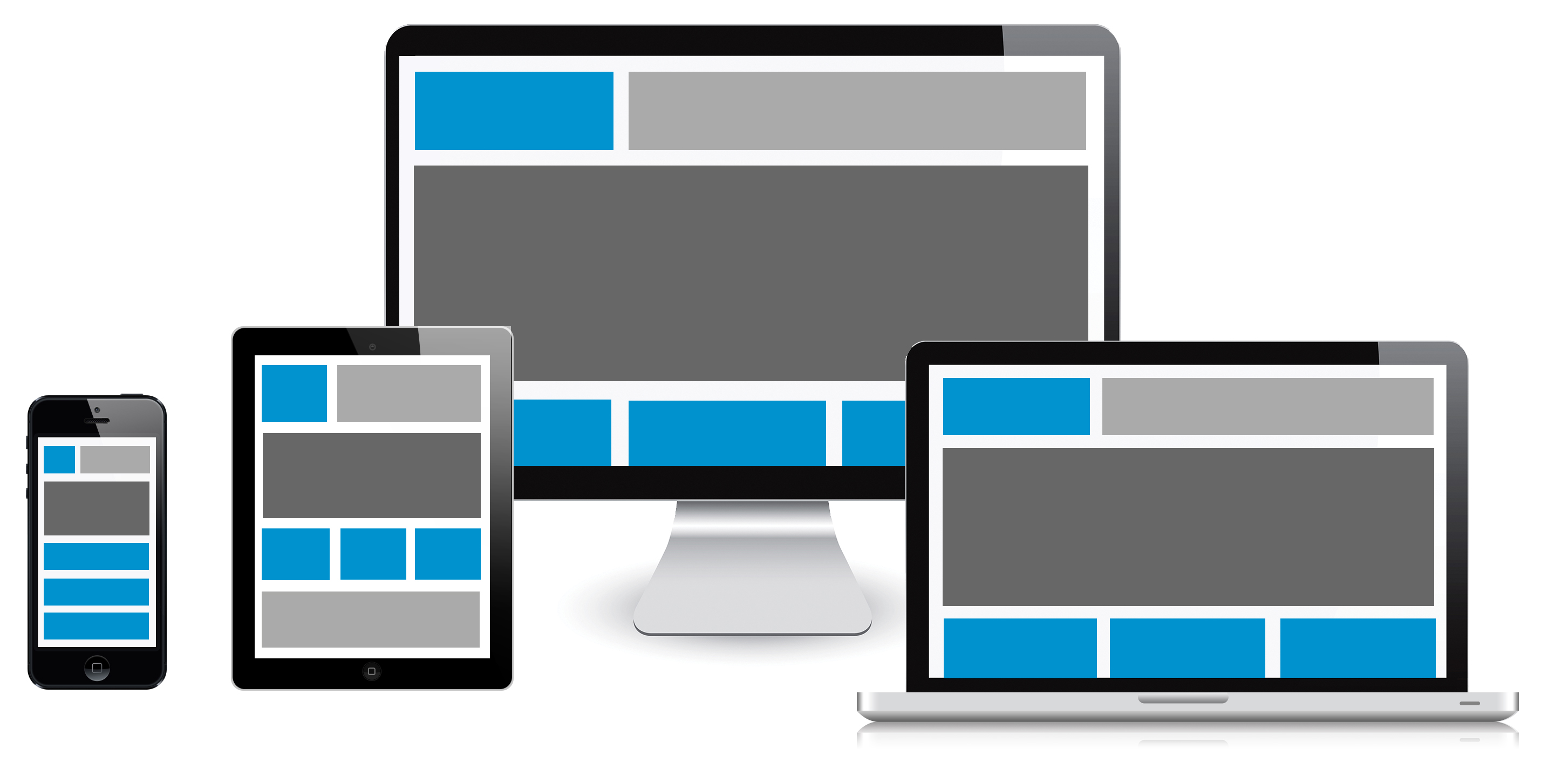
Responsive Web design is the approach that suggests that design and development should respond to the user’s behavior and environment based on screen size, platform and orientation.
The practice consists of a mix of flexible grids and layouts, images and an intelligent use of CSS media queries. As the user switches from their laptop to tablet or smartphone, the website should automatically switch to accommodate for resolution, image size and scripting abilities.
LetteraSenzaBusta.com is a responsive website that works on all devices: it detects different device screen sizes and automatically reformats design and content to best suit the size screen it’s being viewed on: you can use multiple devices view to send real letters online to Italy.
 Privacy Policy
Cookie Policy
Aggiornamento cookie
Termini e Condizioni
Privacy Policy
Cookie Policy
Aggiornamento cookie
Termini e Condizioni
Copyright Innovatio Online Ltd
VAT number: GB206342932